Design Principles - Task 1: Exploration
.png)
9/2/2026 - 23/2/2026 / Week 1 - Week 4
Ten Sze Ching / 0365326
Design Principles GCD60804 / Bachelor of Interactive Spatial Design / Taylor's University
Task 1: Exploration
---
Table of Content
- Module Information Booklet
- Lecture Notes
- Understanding Design Principles
- Explanation of Selected Design
- Feedback
- Reflection
---
Module Information Booklet
---
Lecture Notes
Lecture 0: Intro - Elements & Principles of Design
- Elements of Design are the basic visual building blocks used to create a design, such as line, shape, color, and texture.
-
Principles of Design are the guidelines that organize and arrange these elements to create a clear, balanced, and effective composition.
Point
- Smallest and simplest design element
- Marks a position in space. Moving points in a space create 2D or 3D figures and forms
- Repetitive mark forms a line

- A line is created when a point moves through space.
- Lines can define shapes, create direction. Volume or solid masses can express movement and emotion.

- Two-dimensional area formed by lines, or within three-dimensional object
- It can be geometric or organic and helps define objects in a design.
- Geometric: circle, square, triangle (more precise and regular). Organic: irregular (more informal)

- Three-dimensional objects that have height, width, and depth.
- When form encloses space, the space is called volume.
- Implied in 2D media like painting, illustration or drawing.

- Texture describes the surface quality of an object
- Actual: how it actually feels by touching, Simulated or Implied: how it appears to feel visually.
- It adds richness and interest to a design.

Space
- Space is the area around, between, or within objects in a composition.
- It helps create balance, depth, and focus.
- Three-dimensional space:
- Experienced when we occupy it, starting from our own position and how we relate to people, objects, surfaces, and empty spaces at different distances around us.
- Inside the space: mass. Outside the space: volume.
- Graphic design:
- Space/depth refers to the area that a shape or form occupies.
- Positive: filled space. Negative: empty space
- Depth: Create the illusion of three-dimensional space
- This illusion is achieved by techniques such as overlapping elements, varying sizes, strategic placement, and the use of perspective.

- Colour is the visual result of light from the spectrum.
- It is created by different wavelengths of light that the human eye detects and interprets from reflected light.

- Colour is created by light and includes hue, intensity, value, and saturation.
- It is used to create mood, contrast, and emphasis in a design.
- Hue: Name of a colour in the spectrum, such as red, blue, or yellow.
- Intensity (Saturation): Describes how strong, bright, or pure a color appears. A high intensity color looks vivid, while a low intensity color appears dull or muted.
- Value: How light or dark a color is. Adding white makes a color lighter, while adding black makes it darker.

- Colour schemes: Combinations of colours that work together to create harmony in a design.
- Monochrome: use one single hue, with variations in its value (lightness) and intensity (strength).
- Analogous: use colours that sit next to each other on the colour wheel and share a similar hue.
- Complementary: use two colours that are opposite each other on the colour wheel to create strong contrast.

Monochrome: https://pin.it/5WUyguGAD

- Contrast is the use of strong differences between visual elements.
- Without contrast, a design can look dull and boring.
- Contrast helps to:
- Create visual interest
- Highlight important elements
- Emphasise meaning or content
- Contrast can be created using:
- Colour (light vs dark)
- Size (big vs small)
- Shape
- Texture
- Position

- The human brain naturally looks for patterns, structure, and order.
- The word “Gestalt” comes from German, meaning shape or form.
- Gestalt Theory explains how we visually organise elements into a whole, rather than seeing each part separately.
- Gestalt principles describe how the human eye groups visual elements to make sense of what we see.
- Elements that look similar are perceived as belonging together.
Similarity can be based on:
Colour, Shape, Size, Texture- Helps create patterns and visual grouping.
- The eye naturally follows lines, curves, and paths.
- Human prefer smooth, continuous visual flow instead of broken or scattered elements.
- Used to guide the viewer’s eye through a design.
- The eye prefers to see complete shapes.
- When parts of a shape are missing, the brain fills in the gaps.
- Allows designers to suggest forms without fully drawing them.
Principle of Proximity
- Elements placed close together are seen as related.
- Elements spaced far apart are seen as separate.
- Helps organise content and create structure in layouts.
- We instinctively separate visuals into:
- Figure (main object)
- Ground (background)
- Good figure–ground contrast makes designs clearer and easier to read.
- Symmetrical elements are perceived as unified and balanced.
- Symmetry creates a sense of stability and organisation.
- Law of Uniform Connectedness: Connected elements are seen as related.
- Law of Prägnanz: The brain prefers simple and clear forms.
- Law of Common Fate: Elements moving in the same direction are perceived as a group.
- Balance refers to how visual weight is distributed in a design.
- A balanced design feels stable and visually comfortable.
- Balance can be symmetrical or asymmetrical.
Symmetrical Balance
- Elements are evenly arranged on both sides of a central axis.
- Both sides have equal visual weight.
- Creates a sense of order, formality, and stability.
- Bilateral balance: elements mirror each other horizontally or vertically.
- Radial balance: elements radiate from a central point.
- Approximate symmetry: similar but not identical elements are balanced around the center.


Asymmetrical Balance
- Visual weight is uneven but still feels balanced.
- One dominant element can be balanced by several smaller elements.
- Feels more dynamic, modern, and energetic.
- More challenging to achieve, but visually interesting.

https://visme.co/blog/asymmetrical-balance/

https://visscom.wordpress.com/2013/04/08/the-principle-of-balance/
- Also known as phi (1.618).
- A natural ratio found in nature, art, and architecture.
- Used to create harmony, balance, and visually pleasing compositions.
- Designers use it as a guide for layout and proportion.

Katsushika Hokusai, Under the Wave off Kanagawa, also known as The Great Wave, from the series Thirty-six Views of Mount Fuji, 1831. Woodblock print; ink and color on paper.

Rembrandt, The Anatomy Lesson of Dr. Nicolaes Tulp, 1632.
Rule of Thirds
- A composition guideline to create visual interest.
- The image is divided into 3 equal parts horizontally and vertically.
- Important elements are placed along the lines or at their intersections.
- Makes compositions feel more dynamic than centered layouts.


- Emphasis is used to create focus or dominance in a design.
- It helps direct the viewer’s attention to the most important element.
Emphasis can be created using:
Colour, Size, Shape, Value (light vs dark), Position

Claude Monet, Impression, Sunrise, 1872
Lecture 3: Repetition & Movement
- Repetition is the repeated use of visual elements in a design.
- It helps make a design feel active and organised.
Repetition creates p
attern, rhythm and consistency
- Pattern is created when elements are repeated in a predictable way.
- Rhythm is the visual flow created by repetition.
- Repetition increases visual interest and surface richness.

- Variety is important to avoid boring or monotonous designs.
- It introduces small changes while keeping repetition.
Variety can be created through:
Changes in size, colour, shape, angle, spacing

- Movement refers to how the viewer’s eye travels through a composition.
- It is the visual path that guides attention from one element to another.
- Movement makes a design feel dynamic instead of static.

- Hierarchy is the organisation of content to show importance.
- It helps viewers know: What to look at first, What is secondary
- Hierarchy guides navigation and meaning.

- Alignment is how elements line up along edges, rows, columns, or a centre.
It creates: u
nity, order, visual stability- Alignment also helps guide the viewer’s eye through a design.

- Harmony is achieved when design elements share common traits.
- These traits can include: colour, shape, style, mood or theme
- Harmony makes a design feel visually pleasing and consistent.
- Variety introduces small differences to keep the design interesting.
- Without variety, harmony can become boring or monotonous.

- Unity is the sense of oneness in a design.
- It is created by repeating certain elements throughout a composition, such as: colours, shapes, materials, visual styles
- Unity helps pull all elements together into a single theme.
- Difference between harmony & unity:
- Harmony focuses on how similar elements work well together.
- Unity focuses on how all elements are combined to form a complete whole.

- Scale refers to the size of an object in relation to other objects.
- Scale can be shown through:
- Actual measurement
- Visual comparison
- Unusual or exaggerated scale can create strong visual impact.
- Proportion refers to the size relationship between parts of the same object or elements in a design.
- Good proportion creates balance and harmony.
- Poor proportion can create tension or distortion.
Symbol
- A symbol is a sign, shape, or object used to represent something else.
- In design, symbols can communicate complex ideas quickly, sometimes equal to a full sentence or story.
- Pictorial Symbols
- Simplified images that directly relate to what they represent.
- Easy to understand visually.

- Abstract Symbols
- Look like the objects they represent but with fewer details.
- More simplified and stylised.

- Arbitrary Symbols
- Have no visual resemblance to what they represent.
- Meaning is learned or culturally agreed.
- Often based on geometric shapes or colours.


Word and Image
Importance of Imagery
- Images are essential in both print and digital design.
- Viewers relate more easily when relevant and appropriate images are used.
Importance of Words
- Words paired with images deepen meaning.
The right typography and placement create h
ierarchy, balance, clear communication
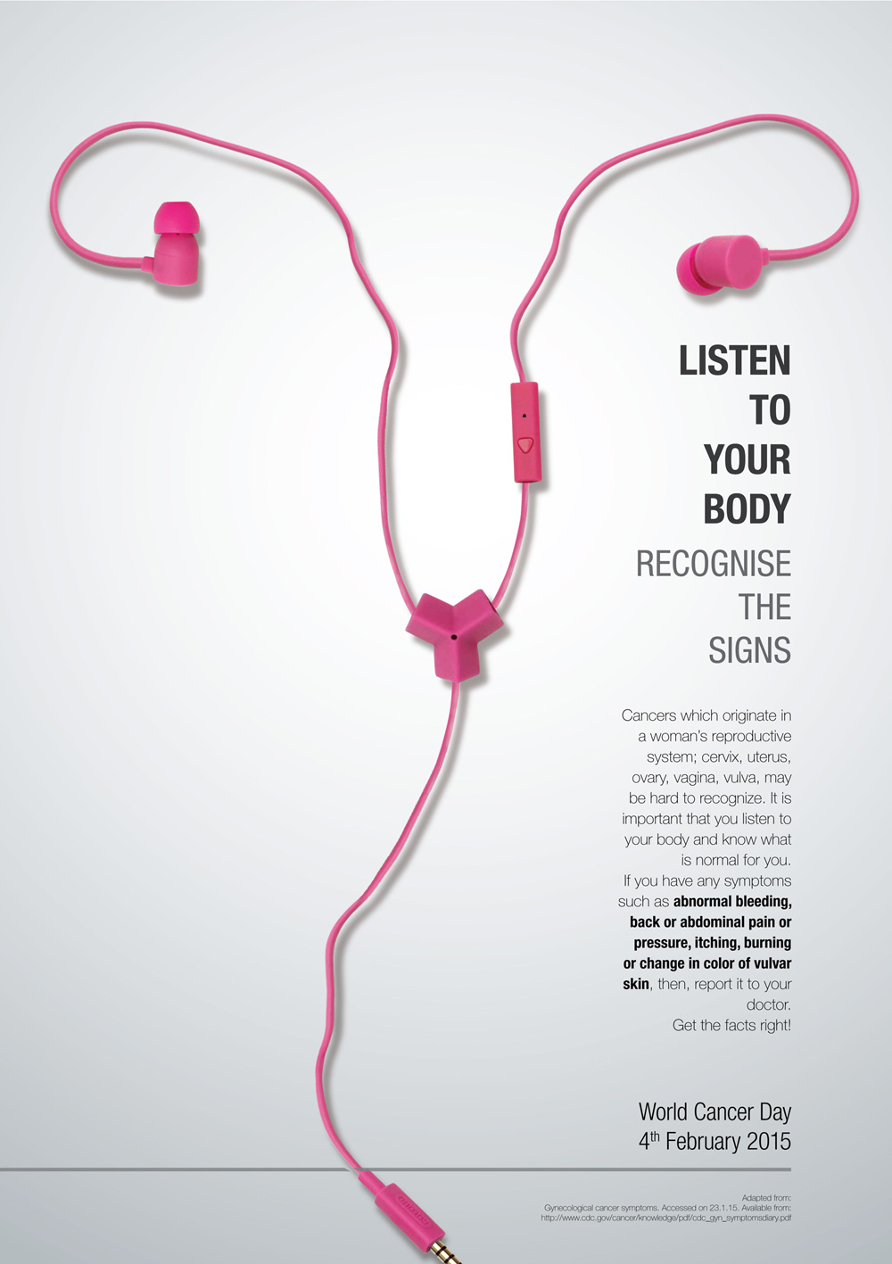
Typography
- Typography is the design and arrangement of text.
- It helps convey the overall message and concept.
- Typeface choice and positioning affect how viewers interpret a design.


https://brandcare.net/blog/wp-content/uploads/2015/02/Cancer-Poster21.jpg

---
Understanding Design Principles
Gestalt Theory explains how viewers naturally organize visual elements into unified wholes rather than seeing individual parts. It focuses on principles like similarity, proximity, closure, and figure-ground to show how meaning is formed through visual perception.

The poster for Peter and the Wolf uses Gestalt principles through the interaction of positive and negative space. The wolf is rendered in darker tones, while the snowy white background acts as negative space, allowing the wolf’s body to curve around it and define the form naturally. This contrast not only separates figure and ground clearly, but also lets the white space subtly form a human silhouette, adding an extra layer of meaning. The composition also follows a golden spiral, guiding the viewer’s eye from the wolf’s tail, along the curve of its body, toward its head and finally to the small duck. Through scale and placement, a clear visual hierarchy is established, with the human figure implied as the most dominant presence, followed by the wolf, and lastly the duck, reinforcing the narrative tension of the story.
Contrast is the use of differences in elements such as colour, size, shape, texture, or value to create visual interest. It helps distinguish elements from one another and improves clarity and readability in a design.

3. Movement
Movement describes how a design leads the viewer’s eye across the composition. This is achieved through lines, shapes, repetition, and directional elements that suggest action or flow.

Emphasis is used to draw attention to a specific focal point within a composition. This is often achieved through contrast, placement, scale, or colour to guide the viewer’s eye to what is most important.

This poster uses emphasis by strongly directing attention to a single glowing figure at the center of the composition. The bright white light of the figure sharply contrasts with the dark background, making it immediately stand out. The small particles and flowing lines all move toward and trail from the figure, visually pointing back to it and reinforcing it as the main focal point, so the viewer’s attention naturally stays on this one object.

https://wpamelia.com/visual-design-guide/
Word and image refer to the relationship between text and visuals in a design. When used effectively, they support and enhance each other to communicate a clearer and stronger message.

7. Harmony & Unity
https://x.com/qry1028_/status/1717090251217506307?s=46&t=nHKxnWLKtjx_P_r-cSxFYA
8. Repetition
Repetition occurs when visual elements such as shapes, colors, or patterns are repeated throughout a design. It creates consistency, strengthens unity, and helps establish a clear visual identity.

The repetition of the taxis and grand pianos visually supports the message “Classical music elevates everything.” By repeatedly showing ordinary New York taxis being lifted and transformed into grand pianos, the poster reinforces the idea that classical music can raise everyday experiences into something more refined and meaningful. The repeated pattern makes the message feel strong, clear, and memorable, showing how repetition works together with concept to communicate the poster’s idea.
A symbol is a visual element that represents an idea, concept, or meaning beyond its literal form. Symbols allow designers to communicate complex messages quickly and emotionally.

The WhatsApp icon is an effective example of the symbol design principle because it uses simple, familiar shapes to represent a clear idea. The speech bubble symbolizes communication, while the phone handset inside it represents calling and messaging. Combined with the recognizable green colour, the icon instantly communicates the function of the app without the need for text, making it easy to understand across different languages and cultures.
---
Explanation of Selected Design

https://www.behance.net/gallery/216534025/Festiwal-Rymkiewiczowski-2024-Posters
Designer: Katarzyna Zapart
Year: January 11th 2025
Medium: Digital Poster
Size: A1 (7016*9933 pixels)

https://www.behance.net/gallery/216534025/Festiwal-Rymkiewiczowski-2024-Posters
Why I selected this design work:
I selected this artwork because it immediately caught my attention, even before I fully understood the text. At first, I was unsure about the language and the deeper meaning behind it, but the visual composition alone was strong enough to draw me in. The clear contrast between the light upper surface and the darker underground section creates a symbolic division that feels intentional and meaningful. The use of hierarchy, scale, and emphasis guides my eyes toward the center, making the message feel layered and significant. This visual structure made me feel curious and encouraged me to understand more about the poster.
What makes this artwork especially meaningful to me is the emotional response it creates. The glowing warm light in the hand gives a sense of peace and calm, while the black and white skeletal arm introduces a feeling of fear and mystery. The contrast between these elements creates tension and curiosity. The concept of “over” and “under,” linked to the ideas of the conscious and subconscious, suggests that deeper meanings exist beneath the surface. This layered symbolism makes the artwork both intellectually engaging and visually powerful, which is why I find it memorable and meaningful.
(196 words)
Design principle used in this design:
1. Contrast
The poster is divided into two contrasting zones: the upper section is light, dry, and skeletal, while the lower section is dark, organic, and alive. This strong contrast between light and dark visually represents the idea of surface versus underground, death and destruction above, and hidden life and ideas below. The glowing red light in the palm further contrasts with the dark surroundings, symbolising surviving knowledge or consciousness beneath the surface.
2. Emphasis
The hand is the main focal point of the composition. Its large scale, central placement, and glowing core immediately draw the viewer’s attention. Secondary information such as the title and event details is placed above and around the image, creating a clear reading order from image to text.
3. Word and Image
In this poster, the visual already communicates the idea of something hidden beneath the surface through the contrast between the upper and lower sections and the hand reaching into the darkness. Even without understanding the language, the image suggests depth and underground meaning. The title Swiaty Podziemne (“Underworlds”) strengthens this interpretation, as the text reinforces and clarifies what the visual has already expressed. The words and image work together to reinforce the festival’s intellectual theme.
4. Gestalt Theory
The poster applies Gestalt principles, especially figure–ground, proximity, and closure. The strong contrast between the light upper section and the dark underground area clearly separates figure from background, allowing the hand to stand out as the main focus. The division between “surface” and “underworld” is immediately perceived as two distinct yet connected parts, which reflects the theme visually. The viewer’s mind also completes the meaning through closure, interpreting the split image as a metaphor for hidden layers beneath reality. Overall, the design allows the audience to naturally organise the visual elements into a unified and meaningful whole.
---
Feedback
Week 2 (10/2/2026)
- All the examples given for each design principle are suitable and clearly show how the principles work.
- I can add more of my own understanding and explanation of how each design principle is applied in the examples.
- Difference between contrast and emphasis: Contrast is about showing differences between design elements, while emphasis is about creating a main focus in a composition. Emphasis often uses contrast to stand out, but contrast does not always result in emphasis on its own.
Week 3 (17/2/2026)
- Chinese New Year Holiday
Week 4 (24/2/2026)
- Mr. Fitri has reviewed my Task 1 and stated that the explanation is good, so I can proceed to Task 2 and include visual notes on how those principles were applied on my chosen artwork.
Reflection
This task has deepened my understanding of design principles in a meaningful way. Although I am a senior design student, my previous course modules focused more on technical skills and we did not spend much time learning the fundamentals of design principles in depth. Because of that, I had only a surface level understanding of these concepts. This module has allowed me to reconnect with the core foundation of design and truly understand the purpose and essence behind each principle.
Through this learning process, I now see design principles not just as definitions, but as essential tools that guide visual communication. It has strengthened my critical thinking skills, as I am now more aware of why certain design decisions are made and how they affect the overall composition. Moving forward, I believe this deeper understanding will help me create more intentional, meaningful, and well-structured design work.
.jpg)
.png)
Comments
Post a Comment